
For someone whose wardrobe is built on a foundation of black, white, gray, and brown, color has always felt like an outsider in my world, an idea I admired from afar but never embraced. My sartorial choices have always leaned toward the elegant restraint of neutrals, where texture and silhouette take precedence over hue. But something about the Spring/Summer 2025 collections has shifted my perspective.


The Colors That Defined the Runway
This season’s palette feels like a study in balance, soft but not demure, bold but not overwhelming. Designers are embracing color in a way that is at once romantic and powerful, blending pastels with deeper hues to create looks that feel rich and layered rather than flat and fleeting. Here are the shades that are already shaping the fashion narrative of 2025:


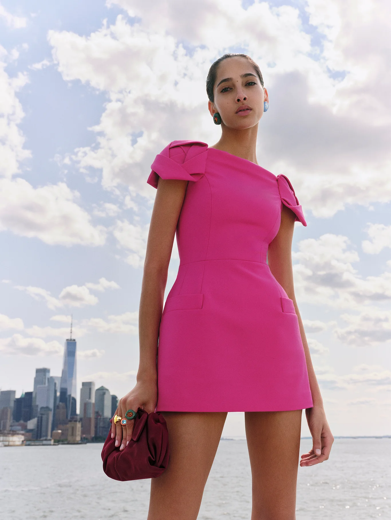
Powder Pink: A Softer Take on Femininity
Gone is the shocking fuchsia of the Barbiecore craze, replaced by a dustier, more sophisticated powder pink. This is a pink that feels lived-in, delicate yet substantial. Think structured blazers, flowing silk trousers, and perfectly tailored coats in this muted blush, redefining how pink can exist in a wardrobe of neutrals. Seen at: Valentino, Chanel, Carolina Herrera


Lavender Lilac: The Whisper of Spring
Purple is quietly taking its place as the defining color of the season, but not in its usual regal, statement-making form. Instead, lilac and lavender have emerged as the shades to watch, airy, ethereal, and just subdued enough to slip into a minimalist’s wardrobe. Seen at: Prada, Givenchy, Alberta Ferretti

Cotton Candy Blue: Cool and Collected
There’s something undeniably calming about the baby-blue hues floating down the runways. Reminiscent of clear spring skies and vintage porcelain, this color has an effortless, almost nostalgic appeal. Unlike the bold cobalt blues of past seasons, this version is soft, wearable, and surprisingly easy to style with traditional neutrals. Seen at: Fendi, Stella McCartney, Loewe, Ralph Lauren

Butter Yellow: A Subtle Statement
Yellow has always felt like a wildcard, a color that demands attention. But this season’s butter yellow offers a different approach, gentle, warm, and inviting rather than brash. It has the charm of vintage sunlit interiors, the softness of faded parchment.Seen at: Dior, Jacquemus, Max Mara

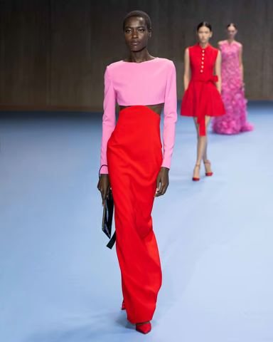

Fiery Red: The Power Move
For those who crave drama, fiery red is the color of the moment. This is not the deep oxblood of fall or the playful cherry of past summers, this is pure, unadulterated red, commanding attention without apology. It feels like the kind of color you wear when you need to be seen, a hue that exudes confidence. Seen at: Ferragamo, Alexander McQueen, Balmain, Caroline Herrera

Tangerine Orange: The Wild Card
This is the shade I never imagined myself considering, bright, unapologetic, full of energy. Yet there’s something compelling about the way designers have used it this season, letting it breathe in fluid silhouettes rather than constraining it in tight, body-conscious designs. Seen at: Bottega Veneta, Versace, Roberto Cavalli
A New Perspective on Color
Color has always been a language I admired but never spoke fluently. Yet, as I sit with these runway images, I find myself captivated, studying the way designers have softened their approach to color. Each shade feels deliberate, carefully chosen to evoke a mood rather than just a trend. Maybe this is the year I finally let color in maybe this is the year I finally let color in.
Follow us on social media for more tips on living an elevated classic lifestyle:
- Instagram: @elevated_classics
- TikTok: @elevated_classics
- Amazon Storefront: Elevated Classics
- ShopMy
Elevate your everyday with timeless elegance.


Leave a Reply